Accordion
Allows you to display content in a collapsible manner, making it easy for users to access information while conserving screen space.
Example
import {
  Accordion,
  AccordionContent,
  AccordionItem,
  AccordionTrigger,
} from "@/components/ui/accordion";

const accordionItems = [
  {
    value: "item-1",
    title: "How do I update my account information?",
    content:
      'You can update your account information by navigating to your profile settings. Click on your profile icon in the top right corner, then select "Account Settings" from the dropdown menu. From there, you can edit your name, email, password, and other personal details.',
  },
  {
    value: "item-2",
    title: "What payment methods are accepted?",
    content:
      "We accept all major credit cards (Visa, Mastercard, American Express), debit cards, PayPal, Apple Pay, and Google Pay. All transactions are processed securely through our encrypted payment gateway to ensure your financial information is protected.",
  },
  {
    value: "item-3",
    title: "How can I track my order?",
    content:
      "Once your order has been shipped, you'll receive a tracking number via email. You can use this tracking number on our website's tracking page or on the carrier's website to monitor your package's journey in real-time. You'll receive updates at each stage of the delivery process.",
  },
];

export default function AccordionDemo() {
  return (
    <Accordion className="w-full max-w-lg mx-auto" defaultValue={[]}>
      {accordionItems.map((item) => (
        <AccordionItem key={item.value} value={item.value}>
          <AccordionTrigger>{item.title}</AccordionTrigger>
          <AccordionContent className="text-muted-foreground">
            {item.content}
          </AccordionContent>
        </AccordionItem>
      ))}
    </Accordion>
  );
}
import {
  Accordion,
  AccordionContent,
  AccordionItem,
  AccordionTrigger,
} from "@/components/ui/accordion";
import { For } from "solid-js";

const accordionItems = [
  {
    value: "item-1",
    title: "How do I update my account information?",
    content:
      'You can update your account information by navigating to your profile settings. Click on your profile icon in the top right corner, then select "Account Settings" from the dropdown menu. From there, you can edit your name, email, password, and other personal details.',
  },
  {
    value: "item-2",
    title: "What payment methods are accepted?",
    content:
      "We accept all major credit cards (Visa, Mastercard, American Express), debit cards, PayPal, Apple Pay, and Google Pay. All transactions are processed securely through our encrypted payment gateway to ensure your financial information is protected.",
  },
  {
    value: "item-3",
    title: "How can I track my order?",
    content:
      "Once your order has been shipped, you'll receive a tracking number via email. You can use this tracking number on our website's tracking page or on the carrier's website to monitor your package's journey in real-time. You'll receive updates at each stage of the delivery process.",
  },
];

export default function AccordionDemo() {
  return (
    <Accordion class="w-full max-w-lg mx-auto" defaultValue={[]}>
      <For each={accordionItems}>
        {(item) => (
          <AccordionItem value={item.value}>
            <AccordionTrigger>{item.title}</AccordionTrigger>
            <AccordionContent class="text-tertiary">
              {item.content}
            </AccordionContent>
          </AccordionItem>
        )}
      </For>
    </Accordion>
  );
}
How to install and use
Complete the manual installation setup
If you haven't already completed the first 4 steps of the manual installation guide, please do so before continuing to install these components.
Create a accordion.tsx file and paste the following code into it.
import { Accordion as AccordionPrimitive } from "@ark-ui/react/accordion";
import { ChevronDownIcon } from "lucide-react";
import type { ComponentProps, ReactNode } from "react";

import { cn } from "@/lib/utils";

function Accordion({
  className,
  ...props
}: ComponentProps<typeof AccordionPrimitive.Root>) {
  return (
    <AccordionPrimitive.Root className={cn("w-full", className)} {...props} />
  );
}

function AccordionItem({
  className,
  ...props
}: ComponentProps<typeof AccordionPrimitive.Item>) {
  return (
    <AccordionPrimitive.Item
      className={cn(
        "border-b border-border last:border-b-0",
        className
      )}
      {...props}
    />
  );
}

interface AccordionTriggerProps
  extends ComponentProps<typeof AccordionPrimitive.ItemTrigger> {
  /**
   * Optional icon or content to display on the left side
   */
  leftIcon?: ReactNode;
  /**
   * Optional icon or content to display on the right side
   * If not provided, defaults to ChevronDownIcon
   */
  rightIcon?: ReactNode;
}

function AccordionTrigger({
  className,
  children,
  leftIcon,
  rightIcon,
  ...props
}: AccordionTriggerProps) {
  return (
    <AccordionPrimitive.ItemTrigger
      className={cn(
        "group flex w-full items-center gap-4 py-4 text-left cursor-pointer text-sm font-medium transition-all outline-none",
        "hover:underline",
        "focus-visible:outline-none focus-visible:ring-2 focus-visible:ring-ring focus-visible:ring-offset-2",
        "disabled:pointer-events-none disabled:opacity-50",
        "[&[data-state=open]>.accordion-chevron]:rotate-180",
        "data-[state=closed]:text-primary/60 data-[state=closed]:hover:text-primary data-[state=open]:text-primary",
        className
      )}
      {...props}
    >
      {/* Left Icon Slot */}
      {leftIcon}

      {/* Title/Content */}
      <span className="flex-1">{children}</span>

      {/* Right Icon Slot */}
      {rightIcon ? (
        <span className="ml-auto">{rightIcon}</span>
      ) : (
        <ChevronDownIcon className="accordion-chevron text-muted-foreground pointer-events-none size-4 shrink-0 transition-transform duration-200 ml-auto" />
      )}
    </AccordionPrimitive.ItemTrigger>
  );
}

function AccordionContent({
  className,
  children,
  ...props
}: ComponentProps<typeof AccordionPrimitive.ItemContent>) {
  return (
    <AccordionPrimitive.ItemContent
      className={cn(
        "overflow-hidden text-sm",
        // Ark UI recommended animations
        "data-[state=closed]:animate-accordion-collapse data-[state=open]:animate-accordion-expand",
        className
      )}
      {...props}
    >
      <div className={cn("pb-4", className)}>{children}</div>
    </AccordionPrimitive.ItemContent>
  );
}

export { Accordion, AccordionItem, AccordionTrigger, AccordionContent };
import {
  AccordionRoot,
  AccordionItem as AccordionItemPrimitive,
  AccordionItemTrigger as AccordionItemTriggerPrimitive,
  AccordionItemContent as AccordionItemContentPrimitive,
  type AccordionRootProps,
  type AccordionItemProps,
  type AccordionItemTriggerProps,
  type AccordionItemContentProps,
} from "@ark-ui/solid/accordion";
import { ChevronDownIcon } from "lucide-solid";
import type { JSX, ParentComponent } from "solid-js";
import { splitProps } from "solid-js";

import { cn } from "@/lib/utils";

export interface AccordionProps extends AccordionRootProps {}

export const Accordion: ParentComponent<AccordionProps> = (props) => {
  const [local, rest] = splitProps(props, ["class", "children"]);
  return (
    <AccordionRoot class={cn("w-full", local.class)} {...rest}>
      {local.children}
    </AccordionRoot>
  );
};

export interface AccordionItemComponentProps extends AccordionItemProps {}

export const AccordionItemComponent: ParentComponent<
  AccordionItemComponentProps
> = (props) => {
  const [local, rest] = splitProps(props, ["class", "children"]);
  return (
    <AccordionItemPrimitive
      class={cn("border-b border-border last:border-b-0", local.class)}
      {...rest}
    >
      {local.children}
    </AccordionItemPrimitive>
  );
};

export interface AccordionTriggerComponentProps
  extends AccordionItemTriggerProps {
  /**
   * Optional icon or content to display on the left side
   */
  leftIcon?: JSX.Element;
  /**
   * Optional icon or content to display on the right side
   * If not provided, defaults to ChevronDownIcon
   */
  rightIcon?: JSX.Element;
}

export const AccordionTriggerComponent: ParentComponent<
  AccordionTriggerComponentProps
> = (props) => {
  const [local, rest] = splitProps(props, [
    "class",
    "children",
    "leftIcon",
    "rightIcon",
  ]);
  return (
    <AccordionItemTriggerPrimitive
      class={cn(
        "group flex w-full items-center gap-4 py-4 text-left cursor-pointer text-sm font-medium transition-all outline-none",
        "hover:underline",
        "focus-visible:outline-none focus-visible:ring-2 focus-visible:ring-ring focus-visible:ring-offset-2",
        "disabled:pointer-events-none disabled:opacity-50",
        "[&[data-state=open]>.accordion-chevron]:rotate-180",
        "data-[state=closed]:text-primary/60 data-[state=closed]:hover:text-primary data-[state=open]:text-primary",
        local.class
      )}
      {...rest}
    >
      {/* Left Icon Slot */}
      {local.leftIcon}

      {/* Title/Content */}
      <span class="flex-1">{local.children}</span>

      {/* Right Icon Slot */}
      {local.rightIcon ? (
        <span class="ml-auto">{local.rightIcon}</span>
      ) : (
        <ChevronDownIcon class="accordion-chevron text-muted-foreground pointer-events-none size-4 shrink-0 transition-transform duration-200 ml-auto" />
      )}
    </AccordionItemTriggerPrimitive>
  );
};

export interface AccordionContentComponentProps
  extends AccordionItemContentProps {}

export const AccordionContentComponent: ParentComponent<
  AccordionContentComponentProps
> = (props) => {
  const [local, rest] = splitProps(props, ["class", "children"]);
  return (
    <AccordionItemContentPrimitive
      class={cn(
        "overflow-hidden text-sm",
        // Ark UI recommended animations
        "data-[state=closed]:animate-accordion-collapse data-[state=open]:animate-accordion-expand",
        local.class
      )}
      {...rest}
    >
      <div class="pb-4">{local.children}</div>
    </AccordionItemContentPrimitive>
  );
};

// Export with cleaner names
export {
  AccordionItemComponent as AccordionItem,
  AccordionTriggerComponent as AccordionTrigger,
  AccordionContentComponent as AccordionContent,
};
import { Accordion as AccordionPrimitive } from "@ark-ui/react/accordion";
import { ChevronDownIcon } from "lucide-react";
import type { ComponentProps, ReactNode } from "react";

import { cn } from "@/lib/utils";

function Accordion({
  className,
  ...props
}: ComponentProps<typeof AccordionPrimitive.Root>) {
  return (
    <AccordionPrimitive.Root className={cn("w-full", className)} {...props} />
  );
}

function AccordionItem({
  className,
  ...props
}: ComponentProps<typeof AccordionPrimitive.Item>) {
  return (
    <AccordionPrimitive.Item
      className={cn(
        "border-b border-border last:border-b-0",
        className
      )}
      {...props}
    />
  );
}

interface AccordionTriggerProps
  extends ComponentProps<typeof AccordionPrimitive.ItemTrigger> {
  /**
   * Optional icon or content to display on the left side
   */
  leftIcon?: ReactNode;
  /**
   * Optional icon or content to display on the right side
   * If not provided, defaults to ChevronDownIcon
   */
  rightIcon?: ReactNode;
}

function AccordionTrigger({
  className,
  children,
  leftIcon,
  rightIcon,
  ...props
}: AccordionTriggerProps) {
  return (
    <AccordionPrimitive.ItemTrigger
      className={cn(
        "group flex w-full items-center gap-4 py-4 text-left cursor-pointer text-sm font-medium transition-all outline-none",
        "hover:underline",
        "focus-visible:outline-none focus-visible:ring-2 focus-visible:ring-ring focus-visible:ring-offset-2",
        "disabled:pointer-events-none disabled:opacity-50",
        "[&[data-state=open]>.accordion-chevron]:rotate-180",
        "data-[state=closed]:text-primary/60 data-[state=closed]:hover:text-primary data-[state=open]:text-primary",
        className
      )}
      {...props}
    >
      {/* Left Icon Slot */}
      {leftIcon}

      {/* Title/Content */}
      <span className="flex-1">{children}</span>

      {/* Right Icon Slot */}
      {rightIcon ? (
        <span className="ml-auto">{rightIcon}</span>
      ) : (
        <ChevronDownIcon className="accordion-chevron text-muted-foreground pointer-events-none size-4 shrink-0 transition-transform duration-200 ml-auto" />
      )}
    </AccordionPrimitive.ItemTrigger>
  );
}

function AccordionContent({
  className,
  children,
  ...props
}: ComponentProps<typeof AccordionPrimitive.ItemContent>) {
  return (
    <AccordionPrimitive.ItemContent
      className={cn(
        "overflow-hidden text-sm",
        // Ark UI recommended animations
        "data-[state=closed]:animate-accordion-collapse data-[state=open]:animate-accordion-expand",
        className
      )}
      {...props}
    >
      <div className={cn("pb-4", className)}>{children}</div>
    </AccordionPrimitive.ItemContent>
  );
}

export { Accordion, AccordionItem, AccordionTrigger, AccordionContent };
Finally, Choose any example you like and add it to your project.
For instance, create a new file at components/shared/{example-component-name}.tsx, paste the example code into that file, and then import and use the component wherever you need it in your application.
Overview
The Accordion component allows users to toggle the display of sections of content. It's built with Ark UI primitives and styled with Tailwind CSS for a modern, accessible experience.
Anatomy
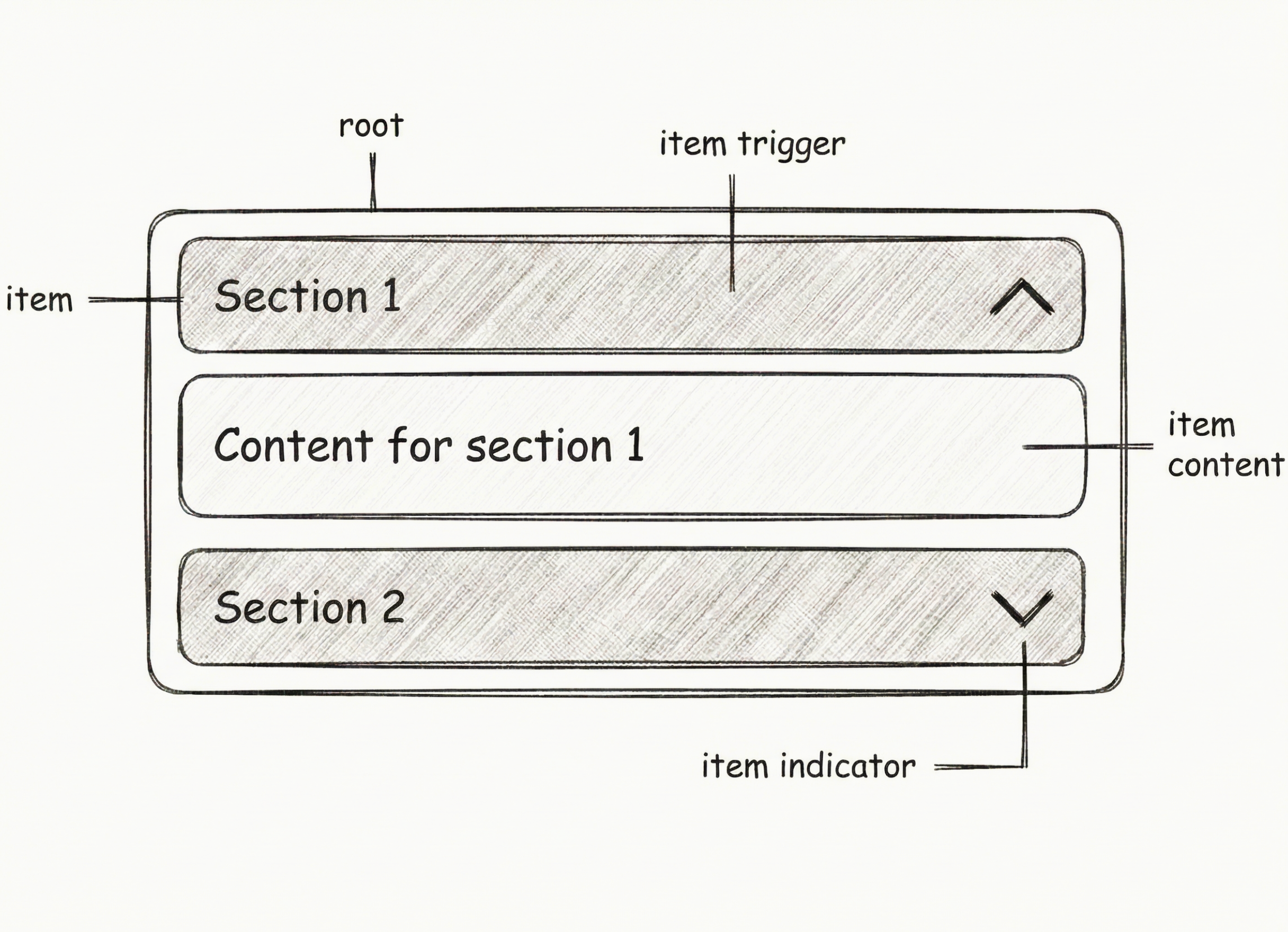
The accordion consists of the following parts:
- root: The main container wrapping all accordion items
- item: An individual collapsible section
- item trigger: The clickable header that toggles the item's visibility
- item indicator: The icon (typically a chevron) that shows the open/closed state
- item content: The collapsible content area that expands and collapses
Select Examples
Multiple Items Open
Set multiple={true} to allow multiple items to be open simultaneously.
import {
  Accordion,
  AccordionContent,
  AccordionItem,
  AccordionTrigger,
} from "@/components/ui/accordion";

const accordionItems = [
  {
    value: "item-1",
    title: "How do I update my account information?",
    content:
      'You can update your account information by navigating to your profile settings. Click on your profile icon in the top right corner, then select "Account Settings" from the dropdown menu. From there, you can edit your name, email, password, and other personal details.',
  },
  {
    value: "item-2",
    title: "What payment methods are accepted?",
    content:
      "We accept all major credit cards (Visa, Mastercard, American Express), debit cards, PayPal, Apple Pay, and Google Pay. All transactions are processed securely through our encrypted payment gateway to ensure your financial information is protected.",
  },
  {
    value: "item-3",
    title: "How can I track my order?",
    content:
      "Once your order has been shipped, you'll receive a tracking number via email. You can use this tracking number on our website's tracking page or on the carrier's website to monitor your package's journey in real-time. You'll receive updates at each stage of the delivery process.",
  },
];

export default function AccordionMultiple() {
  return (
    <Accordion
      className="w-full max-w-lg mx-auto"
      defaultValue={[]}
      multiple={true}
    >
      {accordionItems.map((item) => (
        <AccordionItem key={item.value} value={item.value}>
          <AccordionTrigger>{item.title}</AccordionTrigger>
          <AccordionContent className="text-muted-foreground">
            {item.content}
          </AccordionContent>
        </AccordionItem>
      ))}
    </Accordion>
  );
}
import {
  Accordion,
  AccordionContent,
  AccordionItem,
  AccordionTrigger,
} from "@/components/ui/accordion";
import { For } from "solid-js";

const accordionItems = [
  {
    value: "item-1",
    title: "How do I update my account information?",
    content:
      'You can update your account information by navigating to your profile settings. Click on your profile icon in the top right corner, then select "Account Settings" from the dropdown menu. From there, you can edit your name, email, password, and other personal details.',
  },
  {
    value: "item-2",
    title: "What payment methods are accepted?",
    content:
      "We accept all major credit cards (Visa, Mastercard, American Express), debit cards, PayPal, Apple Pay, and Google Pay. All transactions are processed securely through our encrypted payment gateway to ensure your financial information is protected.",
  },
  {
    value: "item-3",
    title: "How can I track my order?",
    content:
      "Once your order has been shipped, you'll receive a tracking number via email. You can use this tracking number on our website's tracking page or on the carrier's website to monitor your package's journey in real-time. You'll receive updates at each stage of the delivery process.",
  },
];

export default function AccordionMultiple() {
  return (
    <Accordion
      class="w-full max-w-lg mx-auto"
      defaultValue={[]}
      multiple={true}
    >
      <For each={accordionItems}>
        {(item) => (
          <AccordionItem value={item.value}>
            <AccordionTrigger>{item.title}</AccordionTrigger>
            <AccordionContent class="text-tertiary">
              {item.content}
            </AccordionContent>
          </AccordionItem>
        )}
      </For>
    </Accordion>
  );
}
Collapsible
Use the collapsible prop to allow the user to collapse all panels.
import {
  Accordion,
  AccordionContent,
  AccordionItem,
  AccordionTrigger,
} from "@/components/ui/accordion";

const accordionItems = [
  {
    value: "item-1",
    title: "How do I update my account information?",
    content:
      'You can update your account information by navigating to your profile settings. Click on your profile icon in the top right corner, then select "Account Settings" from the dropdown menu. From there, you can edit your name, email, password, and other personal details.',
  },
  {
    value: "item-2",
    title: "What payment methods are accepted?",
    content:
      "We accept all major credit cards (Visa, Mastercard, American Express), debit cards, PayPal, Apple Pay, and Google Pay. All transactions are processed securely through our encrypted payment gateway to ensure your financial information is protected.",
  },
  {
    value: "item-3",
    title: "How can I track my order?",
    content:
      "Once your order has been shipped, you'll receive a tracking number via email. You can use this tracking number on our website's tracking page or on the carrier's website to monitor your package's journey in real-time. You'll receive updates at each stage of the delivery process.",
  },
];

export default function AccordionCollapsible() {
  return (
    <Accordion
      className="w-full max-w-lg mx-auto"
      defaultValue={[accordionItems[0].value]}
      collapsible
    >
      {accordionItems.map((item) => (
        <AccordionItem key={item.value} value={item.value}>
          <AccordionTrigger>{item.title}</AccordionTrigger>
          <AccordionContent className="text-muted-foreground">
            {item.content}
          </AccordionContent>
        </AccordionItem>
      ))}
    </Accordion>
  );
}
import {
  Accordion,
  AccordionContent,
  AccordionItem,
  AccordionTrigger,
} from "@/components/ui/accordion";
import { For } from "solid-js";

const accordionItems = [
  {
    value: "item-1",
    title: "How do I update my account information?",
    content:
      'You can update your account information by navigating to your profile settings. Click on your profile icon in the top right corner, then select "Account Settings" from the dropdown menu. From there, you can edit your name, email, password, and other personal details.',
  },
  {
    value: "item-2",
    title: "What payment methods are accepted?",
    content:
      "We accept all major credit cards (Visa, Mastercard, American Express), debit cards, PayPal, Apple Pay, and Google Pay. All transactions are processed securely through our encrypted payment gateway to ensure your financial information is protected.",
  },
  {
    value: "item-3",
    title: "How can I track my order?",
    content:
      "Once your order has been shipped, you'll receive a tracking number via email. You can use this tracking number on our website's tracking page or on the carrier's website to monitor your package's journey in real-time. You'll receive updates at each stage of the delivery process.",
  },
];

export default function AccordionCollapsible() {
  return (
    <Accordion
      class="w-full max-w-lg mx-auto"
      defaultValue={[accordionItems[0].value]}
      collapsible
    >
      <For each={accordionItems}>
        {(item) => (
          <AccordionItem value={item.value}>
            <AccordionTrigger>{item.title}</AccordionTrigger>
            <AccordionContent class="text-tertiary">
              {item.content}
            </AccordionContent>
          </AccordionItem>
        )}
      </For>
    </Accordion>
  );
}
With Loader Icon
Add an animated loader icon to indicate active accordion items. The loader spins infinitely when an item is open and displays in a theme-aware color (white/black based on theme). When closed, it shows in a muted grayish color.
import { Loader } from "lucide-react";

import {
  Accordion,
  AccordionContent,
  AccordionItem,
  AccordionTrigger,
} from "@/components/ui/accordion";

/**
 * Renders a loader icon that spins when the accordion is open.
 *
 * @returns The loader icon component styled appropriately for the left side of the trigger.
 */
function AccordionLoaderLeftIcon() {
  return (
    <Loader className="size-5 shrink-0 transition-colors duration-200 text-muted-foreground [.group[data-state=open]_&]:animate-spin [.group[data-state=open]_&]:[animation-duration:1.5s] [.group[data-state=open]_&]:text-primary [.group[data-state=closed]_&]:text-muted-foreground/60" />
  );
}

const accordionItems = [
  {
    value: "item-1",
    title: "Set up shipping options",
    content:
      "Configure multiple shipping methods to meet your customers' needs. Set up local and international delivery options, define shipping zones, and create flexible pricing rules. Integrate with popular carriers for real-time rates and tracking capabilities.",
  },
  {
    value: "item-2",
    title: "Configure tax settings",
    content:
      "Set up tax calculations for different regions and product categories. Configure automatic tax calculation based on customer location, manage tax exemptions, and integrate with tax services for accurate compliance.",
  },
  {
    value: "item-3",
    title: "Manage payment methods",
    content:
      "Enable and configure various payment gateways including credit cards, digital wallets, and bank transfers. Set up payment processing rules, handle refunds, and manage payment security settings.",
  },
];

export default function AccordionWithLoader() {
  return (
    <Accordion
      className="w-full max-w-lg mx-auto"
      defaultValue={[accordionItems[0].value]}
      collapsible
    >
      {accordionItems.map((item) => (
        <AccordionItem key={item.value} value={item.value}>
          <AccordionTrigger leftIcon={<AccordionLoaderLeftIcon />}>
            {item.title}
          </AccordionTrigger>
          <AccordionContent className="pl-5 text-muted-foreground">
            {item.content}
          </AccordionContent>
        </AccordionItem>
      ))}
    </Accordion>
  );
}
import { Loader } from "lucide-solid";
import {
  Accordion,
  AccordionContent,
  AccordionItem,
  AccordionTrigger,
} from "@/components/ui/accordion";
import { For } from "solid-js";

/**
 * Renders a loader icon that spins when the accordion is open.
 *
 * @returns The loader icon component styled appropriately for the left side of the trigger.
 */
function AccordionLoaderLeftIcon() {
  return (
    <Loader class="size-5 shrink-0 transition-colors duration-200 text-secondary [.group[data-state=open]_&]:animate-spin [.group[data-state=open]_&]:[animation-duration:1.5s] [.group[data-state=open]_&]:text-brand-primary [.group[data-state=closed]_&]:text-brand-quaternary/60" />
  );
}

const accordionItems = [
  {
    value: "item-1",
    title: "Set up shipping options",
    content:
      "Configure multiple shipping methods to meet your customers' needs. Set up local and international delivery options, define shipping zones, and create flexible pricing rules. Integrate with popular carriers for real-time rates and tracking capabilities.",
  },
  {
    value: "item-2",
    title: "Configure tax settings",
    content:
      "Set up tax calculations for different regions and product categories. Configure automatic tax calculation based on customer location, manage tax exemptions, and integrate with tax services for accurate compliance.",
  },
  {
    value: "item-3",
    title: "Manage payment methods",
    content:
      "Enable and configure various payment gateways including credit cards, digital wallets, and bank transfers. Set up payment processing rules, handle refunds, and manage payment security settings.",
  },
];

export default function AccordionWithLoader() {
  return (
    <Accordion
      class="w-full max-w-lg mx-auto"
      defaultValue={[accordionItems[0].value]}
      collapsible
    >
      <For each={accordionItems}>
        {(item) => (
          <AccordionItem value={item.value}>
            <AccordionTrigger leftIcon={<AccordionLoaderLeftIcon />}>
              {item.title}
            </AccordionTrigger>
            <AccordionContent class="pl-5 text-tertiary">
              {item.content}
            </AccordionContent>
          </AccordionItem>
        )}
      </For>
    </Accordion>
  );
}
With Plus/Minus Icons
Display Plus and Minus icons from lucide-react to indicate the accordion state. The Plus icon appears when an item is closed, and the Minus icon appears when an item is open. Both icons are positioned on the left side of the title, with a chevron icon on the right side.
import { Plus, Minus } from "lucide-react";

import {
  Accordion,
  AccordionContent,
  AccordionItem,
  AccordionTrigger,
} from "@/components/ui/accordion";

/**
 * Shows a plus icon when the accordion is closed
 * and a minus icon when the accordion is open.
 *
 * @returns The toggle icon to display on the left of the trigger.
 */
function AccordionToggleLeftIcon() {
  return (
    <>
      <Plus className="accordion-plus-icon size-5 shrink-0 text-muted-foreground transition-opacity duration-200 [.group[data-state=open]_&]:hidden" />
      <Minus className="accordion-minus-icon size-5 shrink-0 text-muted-foreground transition-opacity duration-200 [.group[data-state=closed]_&]:hidden" />
    </>
  );
}

const accordionItems = [
  {
    value: "item-1",
    title: "How do I update my account information?",
    content:
      'You can update your account information by navigating to your profile settings. Click on your profile icon in the top right corner, then select "Account Settings" from the dropdown menu. From there, you can edit your name, email, password, and other personal details.',
  },
  {
    value: "item-2",
    title: "What payment methods are accepted?",
    content:
      "We accept all major credit cards (Visa, Mastercard, American Express), debit cards, PayPal, Apple Pay, and Google Pay. All transactions are processed securely through our encrypted payment gateway to ensure your financial information is protected.",
  },
  {
    value: "item-3",
    title: "How can I track my order?",
    content:
      "Once your order has been shipped, you'll receive a tracking number via email. You can use this tracking number on our website's tracking page or on the carrier's website to monitor your package's journey in real-time. You'll receive updates at each stage of the delivery process.",
  },
];

export default function AccordionWithIcons() {
  return (
    <Accordion
      className="w-full max-w-lg mx-auto"
      defaultValue={[accordionItems[1].value]}
      collapsible
    >
      {accordionItems.map((item) => (
        <AccordionItem key={item.value} value={item.value}>
          <AccordionTrigger leftIcon={<AccordionToggleLeftIcon />}>
            {item.title}
          </AccordionTrigger>
          <AccordionContent className="pl-5 text-muted-foreground">
            {item.content}
          </AccordionContent>
        </AccordionItem>
      ))}
    </Accordion>
  );
}
import { Plus, Minus } from "lucide-solid";
import {
  Accordion,
  AccordionContent,
  AccordionItem,
  AccordionTrigger,
} from "@/components/ui/accordion";
import { For } from "solid-js";

/**
 * Shows a plus icon when the accordion is closed
 * and a minus icon when the accordion is open.
 *
 * @returns The toggle icon to display on the left of the trigger.
 */
function AccordionToggleLeftIcon() {
  return (
    <>
      <Plus class="accordion-plus-icon size-5 shrink-0 text-secondary transition-opacity duration-200 [.group[data-state=open]_&]:hidden" />
      <Minus class="accordion-minus-icon size-5 shrink-0 text-secondary transition-opacity duration-200 [.group[data-state=closed]_&]:hidden" />
    </>
  );
}

const accordionItems = [
  {
    value: "item-1",
    title: "How do I update my account information?",
    content:
      'You can update your account information by navigating to your profile settings. Click on your profile icon in the top right corner, then select "Account Settings" from the dropdown menu. From there, you can edit your name, email, password, and other personal details.',
  },
  {
    value: "item-2",
    title: "What payment methods are accepted?",
    content:
      "We accept all major credit cards (Visa, Mastercard, American Express), debit cards, PayPal, Apple Pay, and Google Pay. All transactions are processed securely through our encrypted payment gateway to ensure your financial information is protected.",
  },
  {
    value: "item-3",
    title: "How can I track my order?",
    content:
      "Once your order has been shipped, you'll receive a tracking number via email. You can use this tracking number on our website's tracking page or on the carrier's website to monitor your package's journey in real-time. You'll receive updates at each stage of the delivery process.",
  },
];

export default function AccordionWithIcons() {
  return (
    <Accordion
      class="w-full max-w-lg mx-auto"
      defaultValue={[accordionItems[1].value]}
      collapsible
    >
      <For each={accordionItems}>
        {(item) => (
          <AccordionItem value={item.value}>
            <AccordionTrigger leftIcon={<AccordionToggleLeftIcon />}>
              {item.title}
            </AccordionTrigger>
            <AccordionContent class="pl-5 text-tertiary">
              {item.content}
            </AccordionContent>
          </AccordionItem>
        )}
      </For>
    </Accordion>
  );
}
FAQ with Icons
A FAQ-style accordion with contextual icons for each item. Each accordion item features a left icon representing the topic, Plus/Minus icons on the right to indicate state, and a smooth hover effect on the trigger. The container has a subtle background with rounded corners.
import {
  UserRound,
  CreditCard,
  SquareArrowOutUpRight,
  Plus,
  Minus,
} from "lucide-react";

import {
  Accordion,
  AccordionContent,
  AccordionItem,
  AccordionTrigger,
} from "@/components/ui/accordion";
import { cn } from "@/lib/utils";
import type { LucideIcon } from "lucide-react";

interface AccordionItemIconProps {
  icon: LucideIcon;
}

/**
 * Renders the left icon for an accordion item.
 *
 * @param icon - A Lucide icon component to display on the left.
 * @returns The icon component styled appropriately.
 */
function AccordionItemLeftIcon({ icon: Icon }: AccordionItemIconProps) {
  return (
    <Icon className="size-5 shrink-0 text-primary/40 transition duration-200 [.group[data-state=closed]:hover_&]:text-primary [.group[data-state=open]_&]:text-primary" />
  );
}

/**
 * Shows a plus icon when the accordion is closed
 * and a minus icon when the accordion is open.
 *
 * @returns The toggle icon to display on the right of the trigger.
 */
function AccordionToggleRightIcon() {
  return (
    <>
      <Plus className="accordion-plus-icon size-5 shrink-0 text-muted-foreground transition-opacity duration-200 [.group[data-state=open]_&]:hidden" />
      <Minus className="accordion-minus-icon size-5 shrink-0 text-muted-foreground transition-opacity duration-200 [.group[data-state=closed]_&]:hidden" />
    </>
  );
}

const accordionItems = [
  {
    value: "item-1",
    title: "How do I update my account information?",
    content:
      "To update your account information, please log in to your account and navigate to the settings section. From there, you can update your personal details, contact information, and other relevant information.",
    icon: UserRound,
  },
  {
    value: "item-2",
    title: "What payment methods are accepted?",
    content:
      "We accept all major credit cards (Visa, Mastercard, American Express), debit cards, PayPal, Apple Pay, and Google Pay. All transactions are processed securely through our encrypted payment gateway to ensure your financial information is protected.",
    icon: CreditCard,
  },
  {
    value: "item-3",
    title: "How do I get a refund?",
    content:
      "To request a refund, please contact our customer support team within 30 days of your purchase. You can reach us through email, phone, or our support portal. Once your request is approved, the refund will be processed to your original payment method within 5-7 business days.",
    icon: SquareArrowOutUpRight,
  },
];

export default function AccordionFAQ() {
  return (
    <Accordion
      className="w-full max-w-lg mx-auto rounded-2xl overflow-hidden border"
      defaultValue={[accordionItems[0].value]}
      collapsible
    >
      {accordionItems.map((item, index) => (
        <AccordionItem
          key={item.value}
          value={item.value}
          className={cn(
            "border-b",
            index === accordionItems.length - 1 && "border-b-0"
          )}
        >
          <AccordionTrigger
            leftIcon={<AccordionItemLeftIcon icon={item.icon} />}
            rightIcon={<AccordionToggleRightIcon />}
            className={cn(
              "px-4 data-[state=closed]:hover:bg-muted/30 data-[state=open]:bg-background",
              "data-[state=closed]:text-primary/60 data-[state=open]:text-primary data-[state=closed]:hover:text-primary"
            )}
          >
            {item.title}
          </AccordionTrigger>
          <AccordionContent className="pl-7 pr-5 text-muted-foreground">
            {item.content}
          </AccordionContent>
        </AccordionItem>
      ))}
    </Accordion>
  );
}
import {
  UserRound,
  CreditCard,
  SquareArrowOutUpRight,
  Plus,
  Minus,
} from "lucide-solid";
import {
  Accordion,
  AccordionContent,
  AccordionItem,
  AccordionTrigger,
} from "@/components/ui/accordion";
import { cn } from "@/lib/utils";
import { For } from "solid-js";
import type { Component } from "solid-js";

interface AccordionItemIconProps {
  icon: Component<{ class?: string }>;
}

/**
 * Renders the left icon for an accordion item.
 *
 * @param icon - A Lucide icon component to display on the left.
 * @returns The icon component styled appropriately.
 */
function AccordionItemLeftIcon(props: AccordionItemIconProps) {
  const Icon = props.icon;
  return (
    <Icon class="size-5 shrink-0 text-primary/40 transition duration-200 [.group[data-state=closed]:hover_&]:text-primary [.group[data-state=open]_&]:text-primary" />
  );
}

/**
 * Shows a plus icon when the accordion is closed
 * and a minus icon when the accordion is open.
 *
 * @returns The toggle icon to display on the right of the trigger.
 */
function AccordionToggleRightIcon() {
  return (
    <>
      <Plus class="accordion-plus-icon size-5 shrink-0 text-secondary transition-opacity duration-200 [.group[data-state=open]_&]:hidden" />
      <Minus class="accordion-minus-icon size-5 shrink-0 text-secondary transition-opacity duration-200 [.group[data-state=closed]_&]:hidden" />
    </>
  );
}

const accordionItems = [
  {
    value: "item-1",
    title: "How do I update my account information?",
    content:
      "To update your account information, please log in to your account and navigate to the settings section. From there, you can update your personal details, contact information, and other relevant information.",
    icon: UserRound,
  },
  {
    value: "item-2",
    title: "What payment methods are accepted?",
    content:
      "We accept all major credit cards (Visa, Mastercard, American Express), debit cards, PayPal, Apple Pay, and Google Pay. All transactions are processed securely through our encrypted payment gateway to ensure your financial information is protected.",
    icon: CreditCard,
  },
  {
    value: "item-3",
    title: "How do I get a refund?",
    content:
      "To request a refund, please contact our customer support team within 30 days of your purchase. You can reach us through email, phone, or our support portal. Once your request is approved, the refund will be processed to your original payment method within 5-7 business days.",
    icon: SquareArrowOutUpRight,
  },
];

export default function AccordionFAQ() {
  return (
    <Accordion
      class="w-full max-w-lg mx-auto rounded-2xl overflow-hidden border"
      defaultValue={[accordionItems[0].value]}
      collapsible
    >
      <For each={accordionItems}>
        {(item, index) => (
          <AccordionItem
            value={item.value}
            class={cn(
              "border-b",
              index() === accordionItems.length - 1 && "border-b-0"
            )}
          >
            <AccordionTrigger
              leftIcon={<AccordionItemLeftIcon icon={item.icon} />}
              rightIcon={<AccordionToggleRightIcon />}
              class={cn(
                "px-4 bg-muted data-[state=closed]:hover:bg-quaternary/40 data-[state=open]:bg-background",
                "data-[state=closed]:text-primary/60 data-[state=open]:text-primary data-[state=closed]:hover:text-primary"
              )}
            >
              {item.title}
            </AccordionTrigger>
            <AccordionContent class="pl-7 pr-5 text-tertiary">
              {item.content}
            </AccordionContent>
          </AccordionItem>
        )}
      </For>
    </Accordion>
  );
}